h34a3032
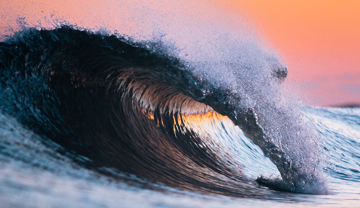
Last light's highlights - Lots of these pink hues are influencing my style as well. Keeping in mind the end product, I've found that the harsher more contrast laden images to be too overwhelming when people are looking for artwork for an apartment or home. These lighter colors tend to work better with peoples furniture or color schemes. I'm trying to keep this in mind when creating the work in post, the colors are there naturally but it had been my style to force people to look at the work and now I'm finding that the more soothing images are, the better they work with a broader audience. Photo: Matt Clark
This is a mixed bag of shots I’ve taken recently. Some are representative of a new style I’ve been trying out. There are also a couple from a series called “Midnight Dreary” that are intended to look as if they are taken in the middle of the night by moonlight, and other images that are like an Ocean Boudoir photo session where you’ll see portraits of breaking surf in a truly intimate fashion.
See more of Matthew’s work at clarkography.com, on Facebook and on Instagram: @mattclarkphotography.